Case Study · Fintech App Design
Travel More
A rewards intelligence platform that helps frequent travelers understand, compare, and maximize the value of every credit card perk, turning passive cardholders into active rewards strategists.
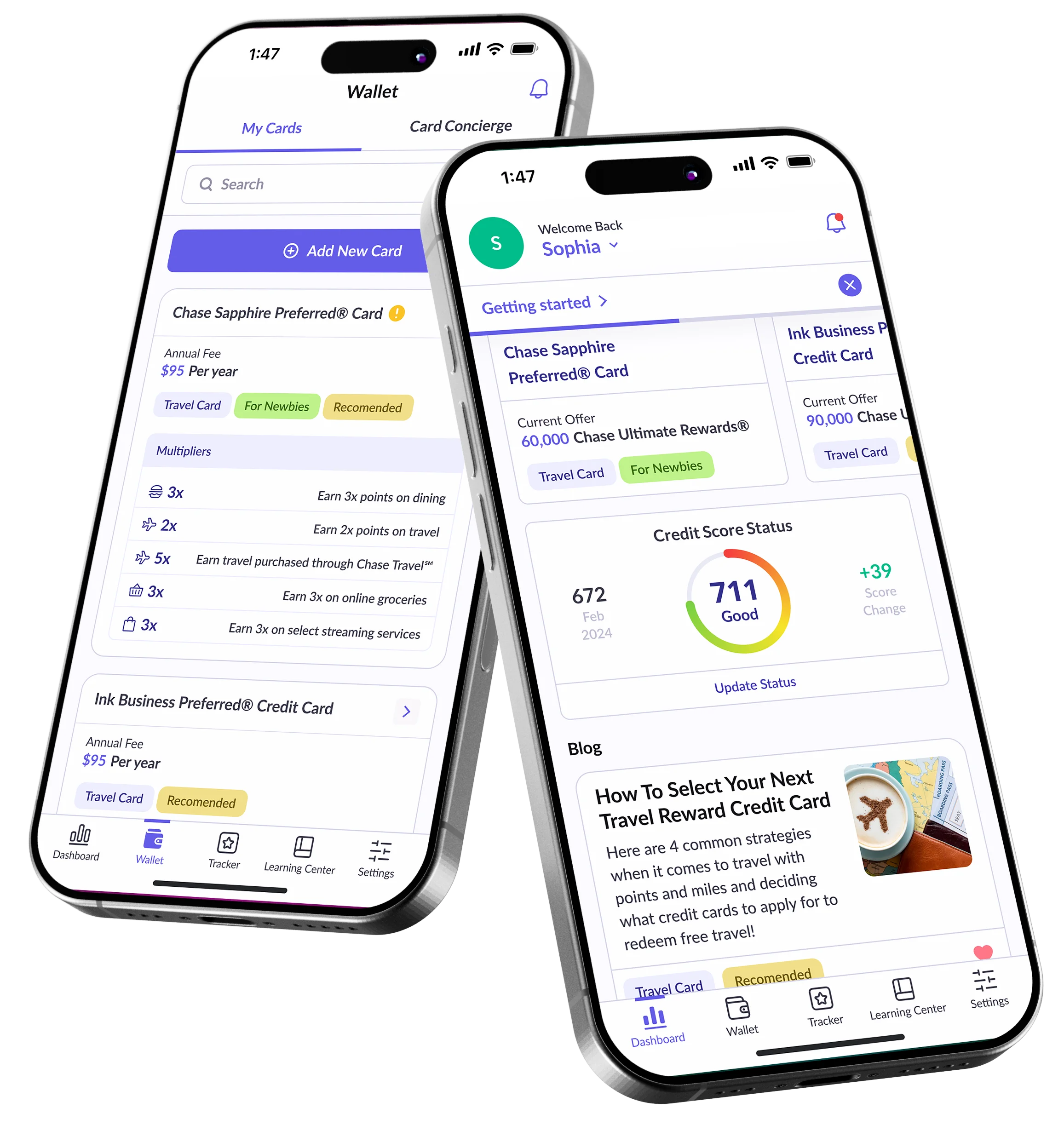
Turn complexity into clarity.
Frequent travelers were leaving thousands in rewards untapped simply because managing multiple cards, loyalty programs, and perks had become too complex. Travel More was designed to give users a single place to understand, compare, and act on the full value of every card they own.
Understanding Travel More
TravelMore came to us with a clear need: travelers were leaving rewards on the table because managing multiple credit cards, loyalty programs, and travel perks had become too complex. Our goal was to design an app that turns that complexity into clarity, giving users a single place to understand, compare, and maximize the value of every card they own.
Knowing Who We're Designing For
Before designing a single screen, we mapped the competitive landscape, segmented the market, built user personas, traced the journey, and defined user stories. Each layer gave us a degree of certainty, so every decision that followed had a reason behind it.
Mapping the Market
No existing platform combines multi-card aggregation, intelligent reward optimization, and personalized redemption guidance in a single travel-focused product.
| Platform | Card Aggregation | Reward Optimizer | Expiry Alerts | Points Calculator | Travel Focus |
|---|---|---|---|---|---|
| Mint | Yes | No | No | No | No |
| AwardWallet | Yes | Partial | Yes | No | Partial |
| MaxRewards | Yes | Yes | Partial | No | No |
| Google Pay | Partial | No | No | No | No |
| Travel More | Yes | Yes | Yes | Yes | Yes |
Who Holds Travel Credit Cards
Four distinct user groups emerged, each with different reward behaviors and different levels of awareness about the value they were leaving behind.
28-45. Manage 3+ premium cards. Have significant rewards but lack visibility into total value or optimal redemption paths.
25-40. Actively accumulate miles and points. Need transfer partner tools and redemption calculators to unlock full value.
26-42. One or two trips per year. Do not know what their card benefits include and regularly miss out on perks they have already paid for.
30-50. Mix of corporate and personal cards. Need to track both separately and identify which card to use per purchase category.
Designing for Real People
Three archetypes distilled from 22 user interviews and 190 survey responses, representing the core informational and motivational needs of the platform.
"I have four cards and I have no idea which one to use for what. I feel like I am leaving money behind every single time I swipe."
"I have been hoarding miles for two years and still have not figured out how to book a flight with them. It takes forever."
"My company has a travel card and I have personal ones. Every month I find out I let points expire. There is no system."
From Confusion to Redemption
The current rewards experience is opaque and frustrating. Travel More compresses six confusing steps into a guided, insight-first flow.
- Step 01Purchase: Which card do I use?User stands at checkout unsure which card maximizes their reward for this category. Defaults to a random choice.Uncertain
- Step 02Accumulate: Points pile up silentlyPoints accumulate across multiple programs. The user has a vague sense they are building toward something but no clear target.Passive
- Step 03Research: Long hours onlineUser tries to research redemption options. Finds forums, blog posts, and card issuer pages that contradict each other.Frustrated
- Step 04Attempt: Complex transfer processUser tries to transfer points. Encounters confusing partner program rules, blackout dates, and hidden minimum thresholds.Overwhelmed
- Step 05Abandon or settle for lessMost users give up and redeem for a low-value option (cash back, gift cards) or let points expire entirely.Defeated
- Step 06Redeem: Travel More makes it clearWith Travel More, users see the real-time value of each redemption path and reach maximum value with confidence.Empowered
What Users Actually Need
Distilled from persona research and journey mapping, these stories defined the feature scope for the first version of Travel More.
- US-01 As a multi-card holder, I want to see all my cards' current points balances and valuations in one dashboard, so I know my total rewards position at a glance.
- US-02 As a daily spender, I want a recommendation for which card to use for each purchase category, so I stop leaving rewards on the table at checkout.
- US-03 As a points accumulator, I want expiry alerts 60 and 30 days before points expire, so I can act before losing value I already earned.
- US-04 As a business traveler, I want to separately track my corporate and personal card rewards, so I always use the right card without mixing up benefits.
- US-05 As a points enthusiast, I want to compare all transfer partner valuations for my points, so I can confidently choose the option with the highest real-world value.
- US-06 As a new user, I want personalized card recommendations based on my existing cards and spending patterns, so I know exactly what I should optimize for next.
Color, Type, and the Language of Value
Colors and a strong style guide establish the visual identity of an app. For Travel More, we chose a deep indigo system that communicates authority, intelligence, and financial confidence, ensuring users trust every insight the app surfaces.
(900) HEX #231F69 Accessibility: 16.8:1 AAA
(600) HEX #635CE7 Accessibility: 5.0:1 AA
Texts HEX #0F1010 Accessibility: 20.4:1 AAA
(BG 50) HEX #F5F7FA Accessibility: 18.1:1 AAA
Where We Landed
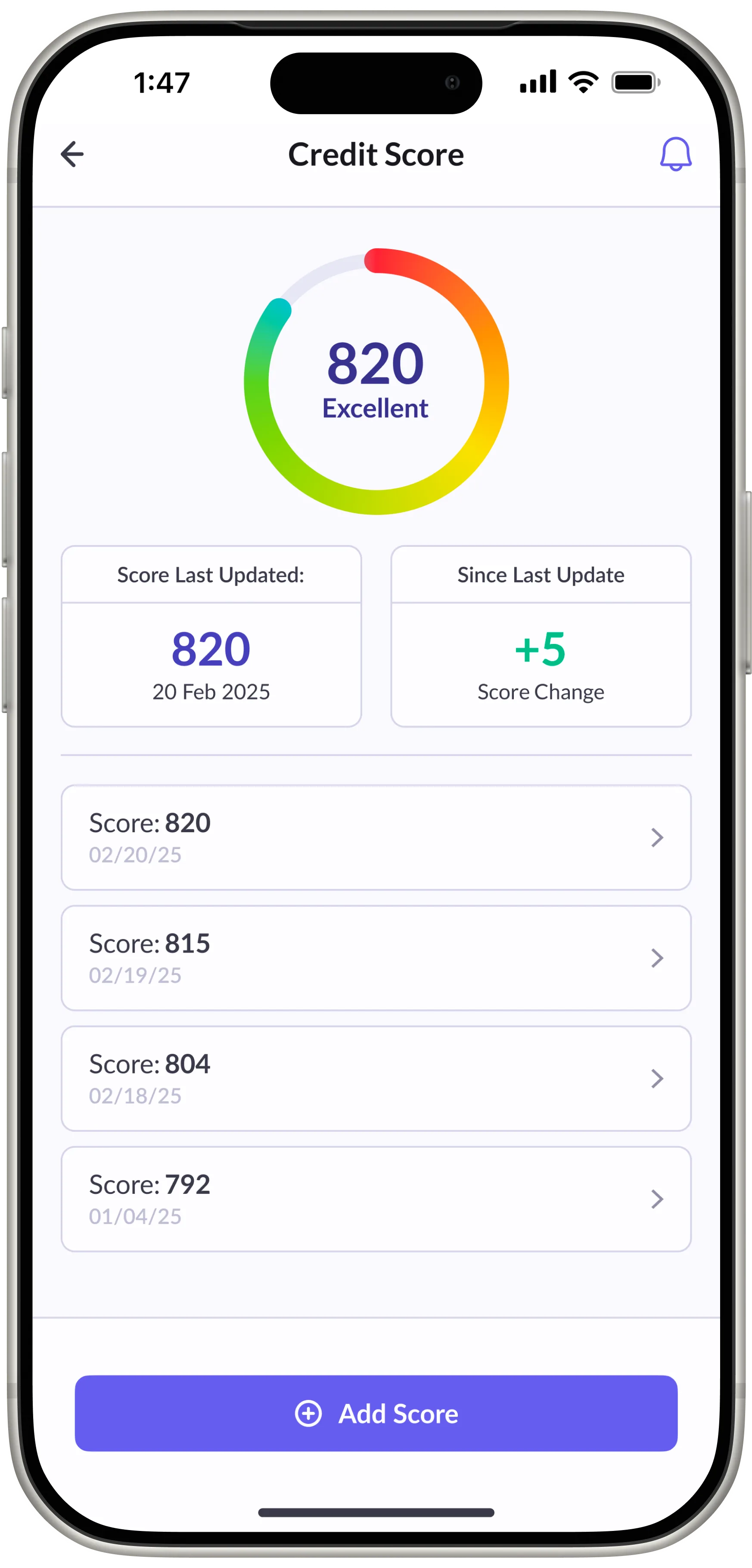
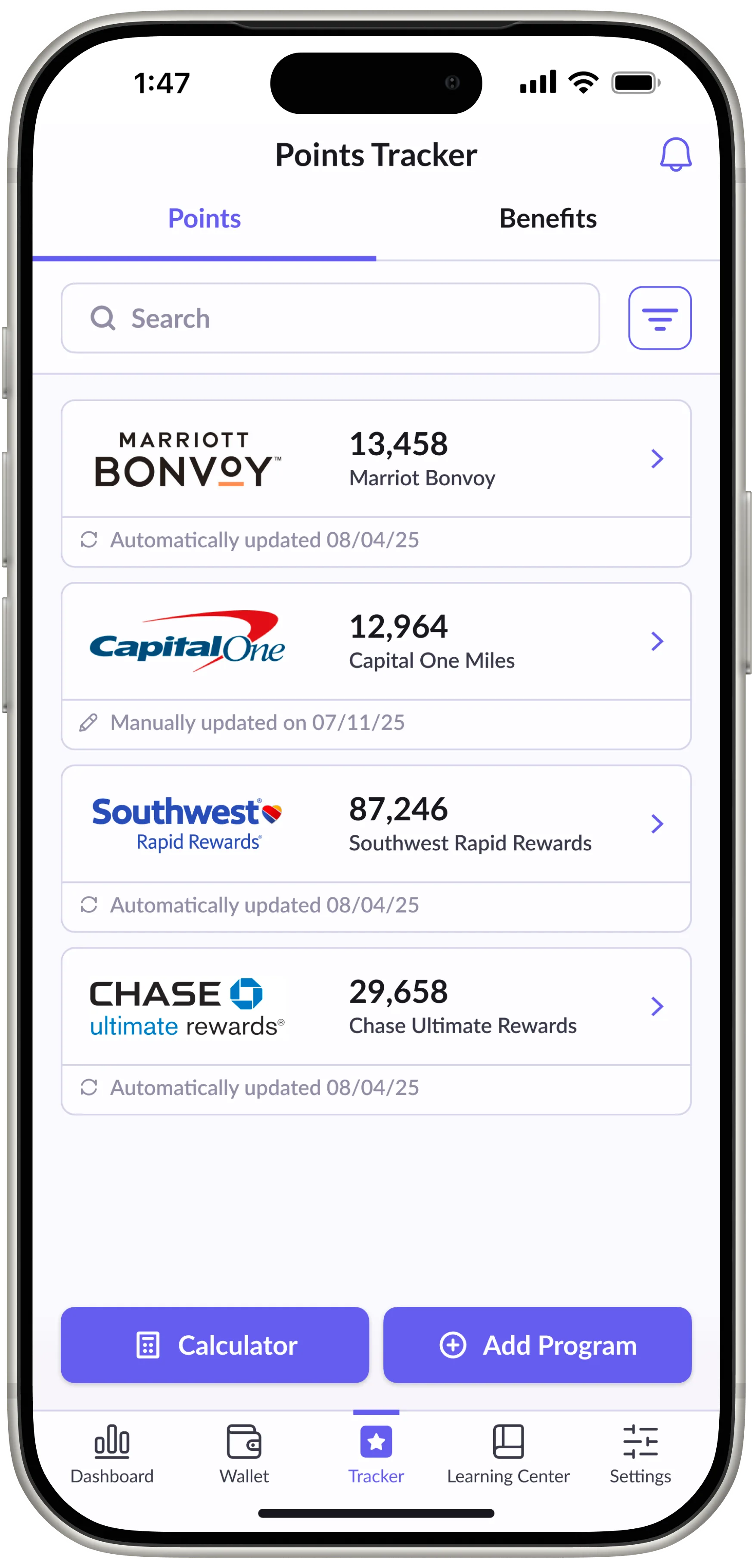
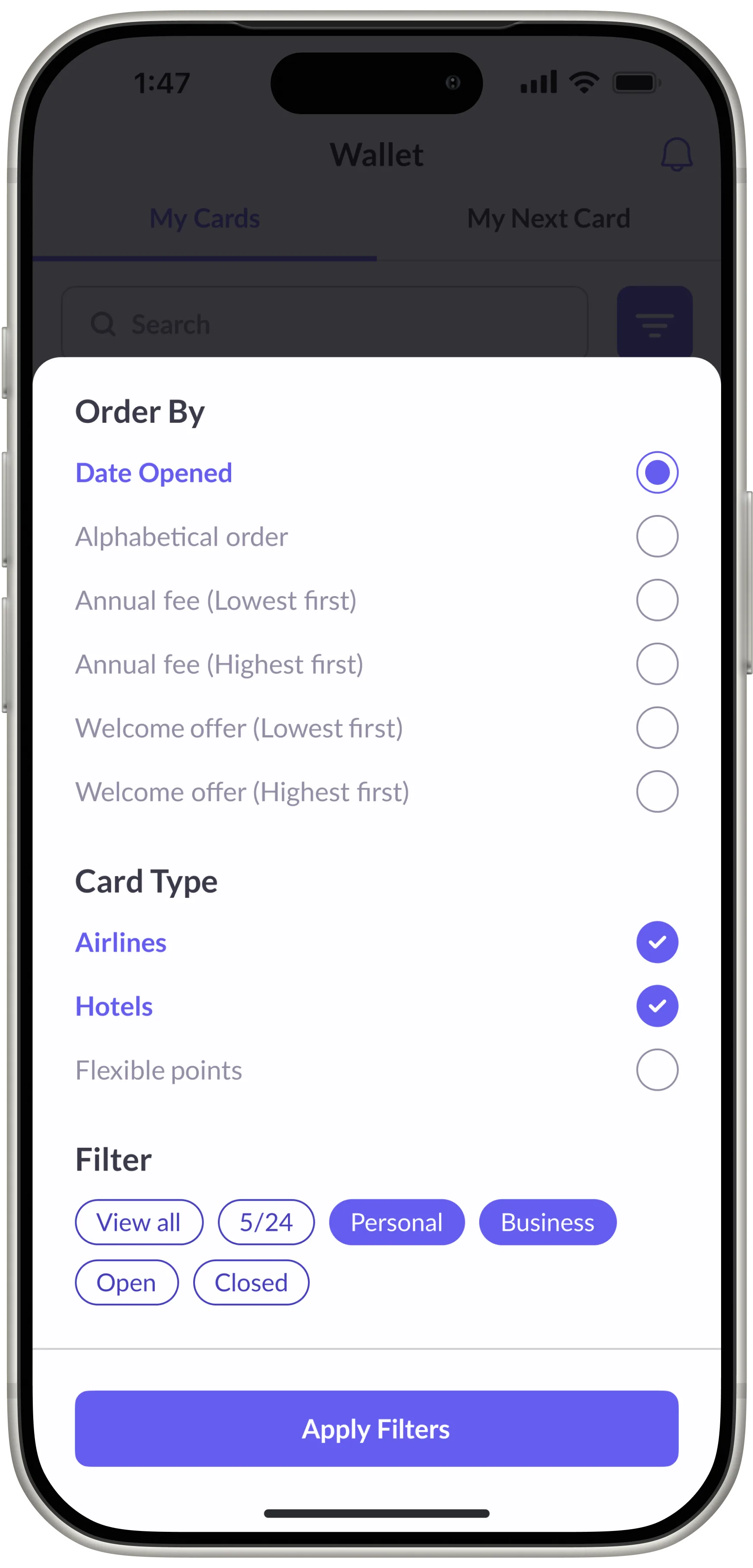
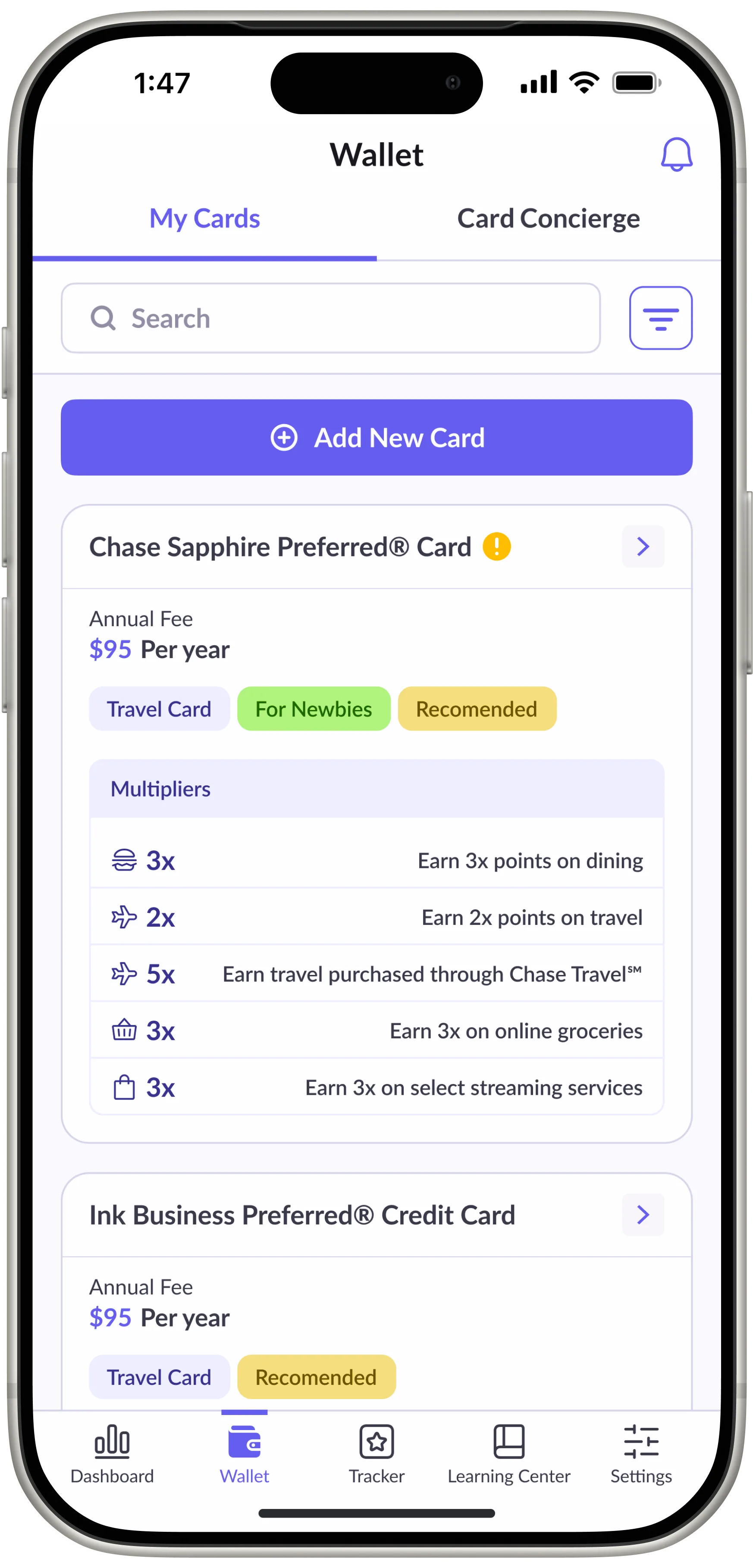
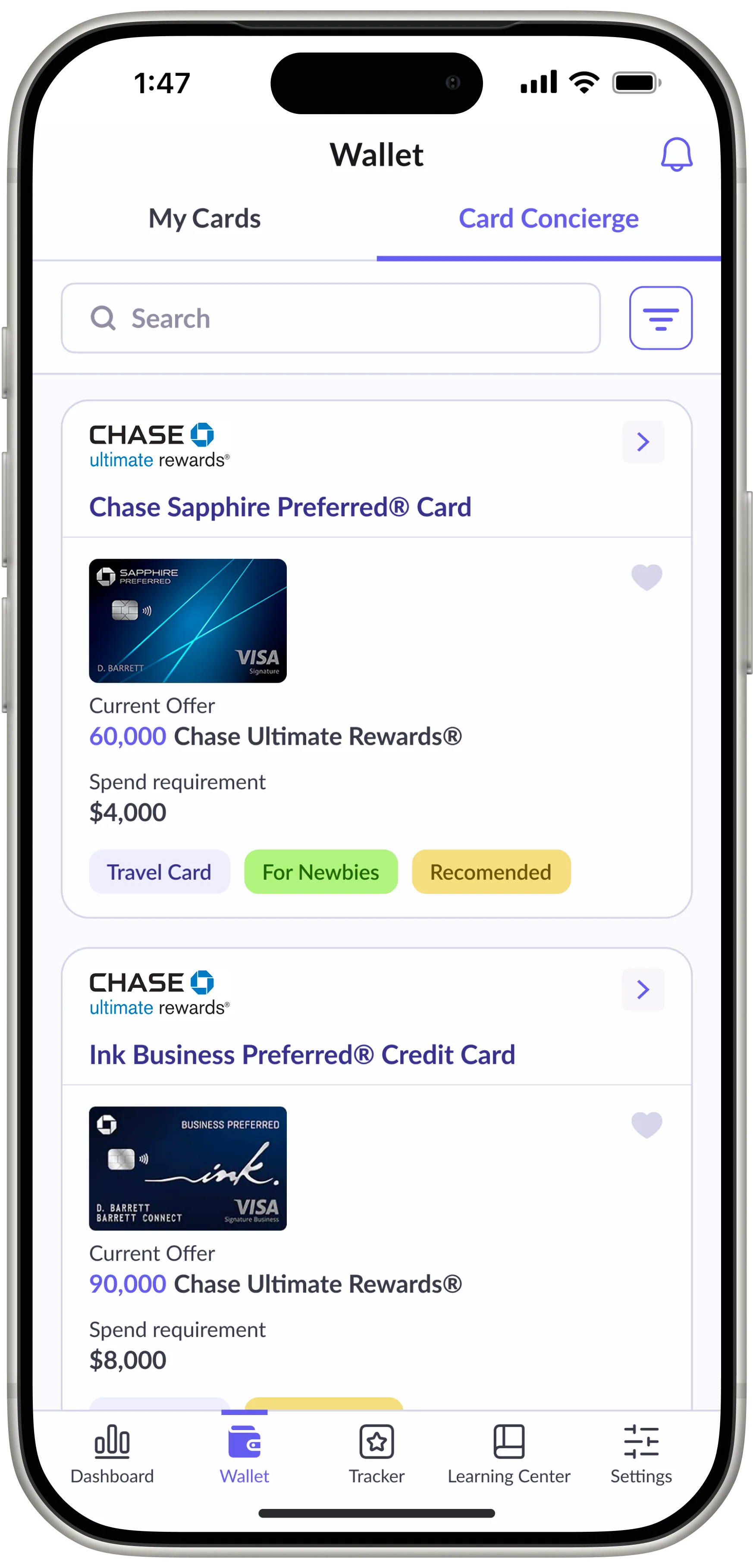
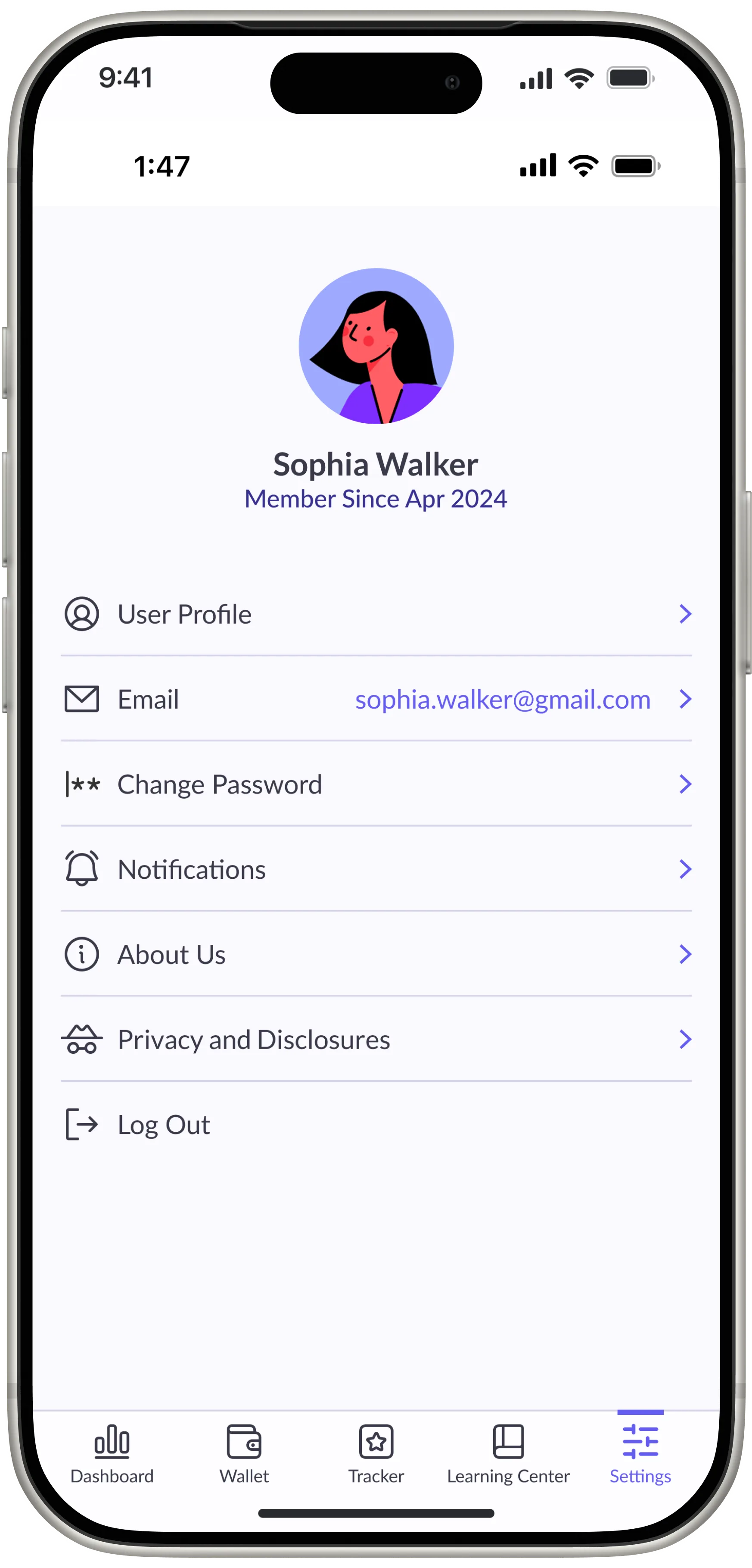
The main challenge was making dense financial data feel approachable without oversimplifying it. Travel More uses progressive disclosure, smart categorization, and a visual hierarchy that leads users from overview to action, never leaving them wondering what to do next.
Your product,
built right.
Travel More showed what happens when you make complexity legible. If you're building a fintech or data-dense product where clarity is the value proposition, let's talk.